Amata it's a great little farm which produces oil and wine with great dedication to organic and traditional production methods. The name, which looks like a misspelling on the name of our little beloved volcano in Tuscany, plays precisely with this ambiguity of verb and noun.
The name Flaminio on the label we created, celebrate the ancient history of central Italy and, at the same time, the previews owner of the farm; a great respect for the past and for the predecessors who lived in the crown of hills around Monte Amiata, between Monticello and Cinigiano.
The aim of this work was to combine tradition and modernity. Featuring a classic line illustration combined with a modern logotype. The next idea was to integrate the company logo with the engraving so that the shape of the brand itself seemed to suggest the landscape context where the farm stands. The shape of Monte Amiata is itself a recognizable icon for the locals; in the work we have tried to recover the typical view of the mountain as it is perceived as a whole from different angles.
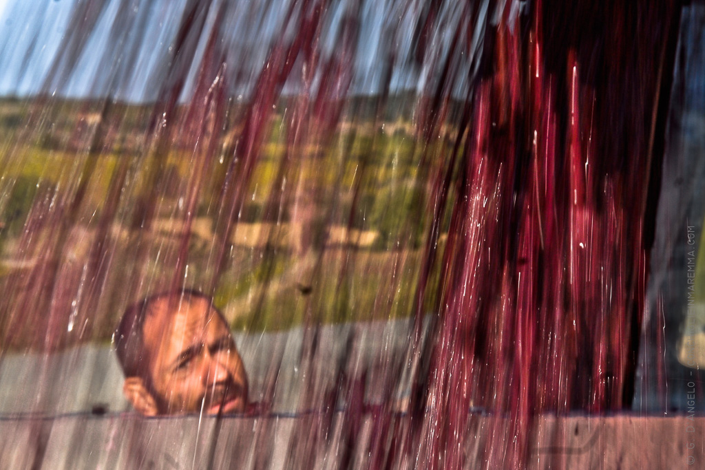
Below is the illustration and still life of the bottle.


")


Follow me for updates or contact me on the socials