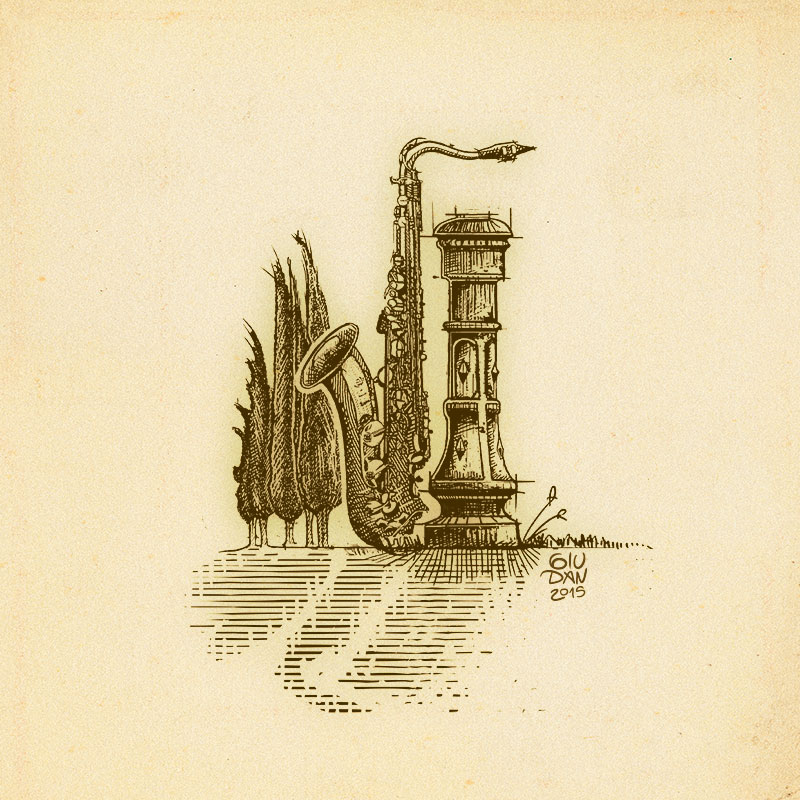
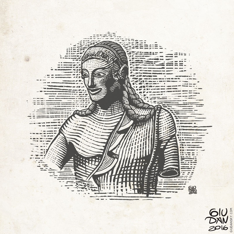
Illustrated composition made for a summer concert poster. It represent the landmark, the environment and the music. Density and thickness of lines is the secret for the perfect engraving style print. It's some kind of a graphical priority that defines the balance between light and shadows; finding the perfect order it's fundamental.
The first step is defining the composition, and that's the creative part. The second step is filling and shadowing the image and that's technique more than everything else.
The engravings were the sons of the modern print. A manual process needed to separate the ink from the paper, playing a balancing game when opacity and dithering still didn't exist in print technology. It was the optimization of the only color ink available: black on the white paper.
At that time the concept of pattern resolution depended to the patience of the illustrator. More details, more realism perception on the print. But it was also a matter of optimizing the lines and the shapes.
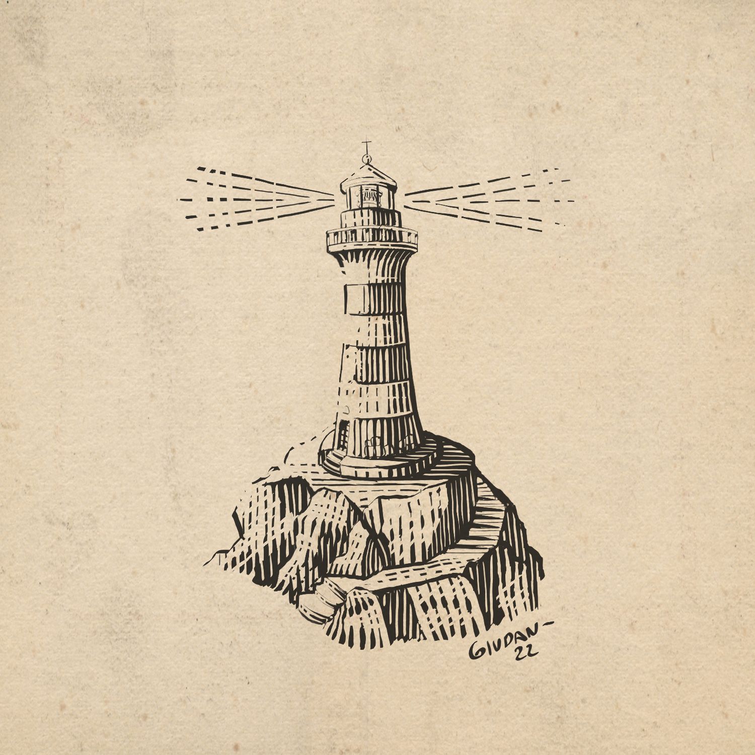
Today engraving prints are an art which recalls past ages, history and traditional atmospheres. I really love those broken lines and dotted strokes dissolving the ink to the paper, caressing the shapes; ancestor of the gradients.

Follow me for updates or contact me on the socials