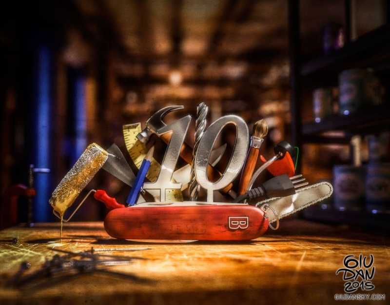
A cgi illustration made for a national DIY magazine celebrating 10 years of guides, articles and reviews. A hardwork in texturing and compositing, for a single illustration that represents the variety and utility of its contents.
My favourite part is the dirty and scratched workbench; I almost can smell the paint stains absorbed on the old wood surface. Everything is made in cgi, including the depth of field effect, light glare and particle hairs. A map of dirty is overlayed on the final work adding grain and grunge details. Again expressing my love for dirty and scratches on artworks. Dirty is real, dirty is detail!


Follow me for updates or contact me on the socials